7 Tips for Designing Your Ecommerce Pages with Your Ideal Customer in Mind (+Examples)

Numerous factors come into play when designing an effective ecommerce page. You need to be mindful of the layout, how the page loads on different devices, and how you describe the product. But before you do any of that, before you write a line of code or a single catchy phrase, you need to consider your ideal customer.
If you were to create a page that targets no one (or tries to target everyone), you’d be wasting valuable time and resources. These types of pages are rarely effective. Instead, you want to speak to someone quite specific. The person you’ve created your brand and products for. The person who is looking for them right now, is about to find your website for the first time.
Offer a Subscription Option
In order to truly give your target audience what they are looking for, you need to understand their purchasing habits. When are they buying your products? How often are they repurchasing? What products do they buy together?
Understanding these actions and their motivation can help you come up with the best bundles, packages, and personalized discounts.
In order to solve another of your ideal customer’s pain points, establish a subscription option. This tactic works well for any products that are used on a regular basis. Coffee, tea, supplements, toothbrush heads — anything that will need to be replaced at regular intervals can be bolstered up with a subscription.
Take a look at this weight gainer supplement. You can purchase it once, or you can subscribe for a regular delivery. You can choose its frequency, and you also get the perks of free shipping and a bit of a discount.
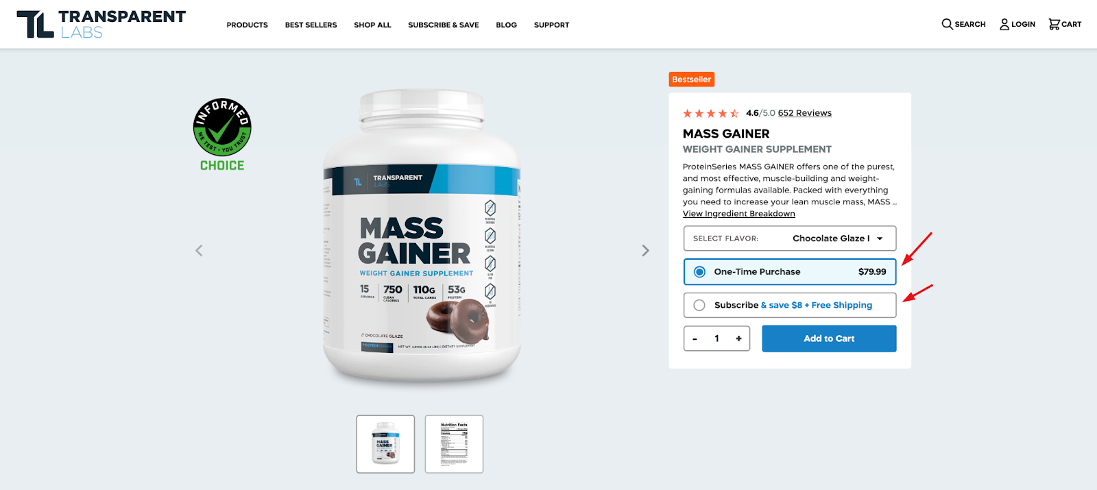
This is a great tactic for boosting sales, but it also genuinely helps the customer out. They will appreciate one less thing they need to think about. They will love the free shipping option and the flexibility to choose how often they want an item delivered.
Make It Easy to Find the Right Product
One of the worst things about online shopping is that you have to spend lots of time looking for a product. True, the same can happen in-store, but at least you’d be strolling around, browsing other products, and perhaps enjoying the shopping experience a little more.
Online, it can turn into quite a hassle, especially if you are not sure what the product you need is called, what product category it falls into, or whether or not you might also need (or like to) buy something else.
When you design a product page or a product category page that circumvents this issue, you’re really helping your ideal customer out.
Consider what would help them find the right product the most. Can you set up filters for them? Can you create unique filters that describe your specific products? What is it that they find the most confusing?
Take a look at this golf cart accessories page. At the very top, you are given plenty of categories to choose from. They give you some of the most popular brands, and you can also pick any product category, from batteries to wheels.
This is a great way to direct traffic and make sure customers aren’t overwhelmed by a bunch of individual products. Instead, they can immediately click through to the category they are interested in.
Offer to Lend a Hand
No matter how much information you provide or how informed your ideal customer may be about the solutions you offer, they may need some help. This is especially true if the product you sell is complex, something that you buy only once in a lifetime, or a technically or otherwise difficult-to-understand product.
There are several ways to help your customers out when this is the case. For starters, you can offer to lend them a hand quite directly.
Check out the solar power systems category page on Shop Solar. When you’ve spent some time browsing it, a popup will appear, offering you a quick quote. All you need to do is answer some questions, and the brand’s team of experts will recommend the right products for your needs.
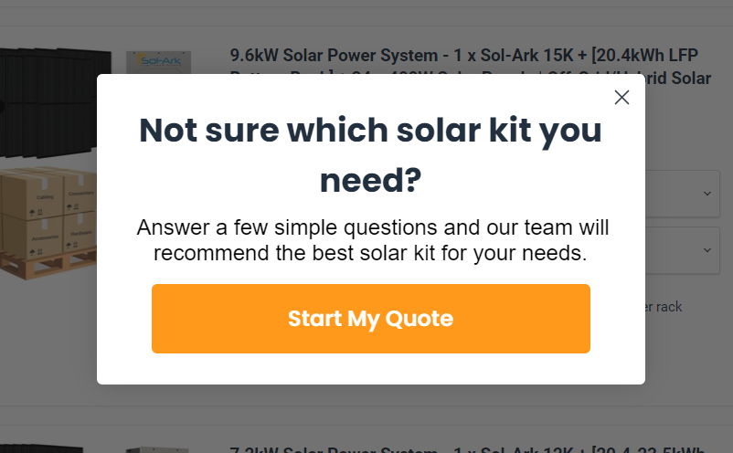
Given the fact that most people don’t know much about solar power systems and kits, this is a great way to increase conversion rates and improve user experience. Instead of making the shopper educate themselves and read through a lot of text, you are using your own expertise and experience to help them make the best decision. It’s like talking to a salesperson.
Make Getting in Touch Super Easy
Sticking to our previous point on the importance of user experience, what do you do when you are not able to provide a quiz for your customers? What if you need more information from them to provide the best advice?
When this is the case, you need to make it easy for your potential customers to contact you directly from the landing page. You don’t want them to look for a contact number or email. They need to be able to get in touch while they are still immersed in product details.
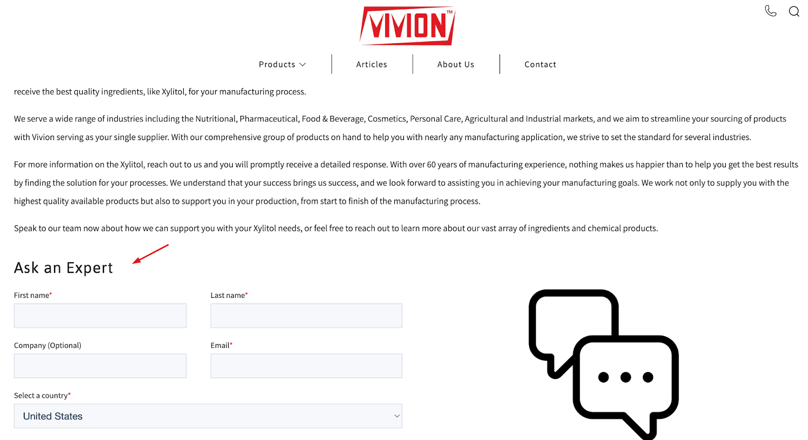
Take a look at this page on bulk xylitol. It gives you two options to get in touch. First, you can ask for a quote by describing your needs and requirements. This is great for customers who are already familiar with this ingredient and just want to hear about the price for the quantity they are looking to buy.
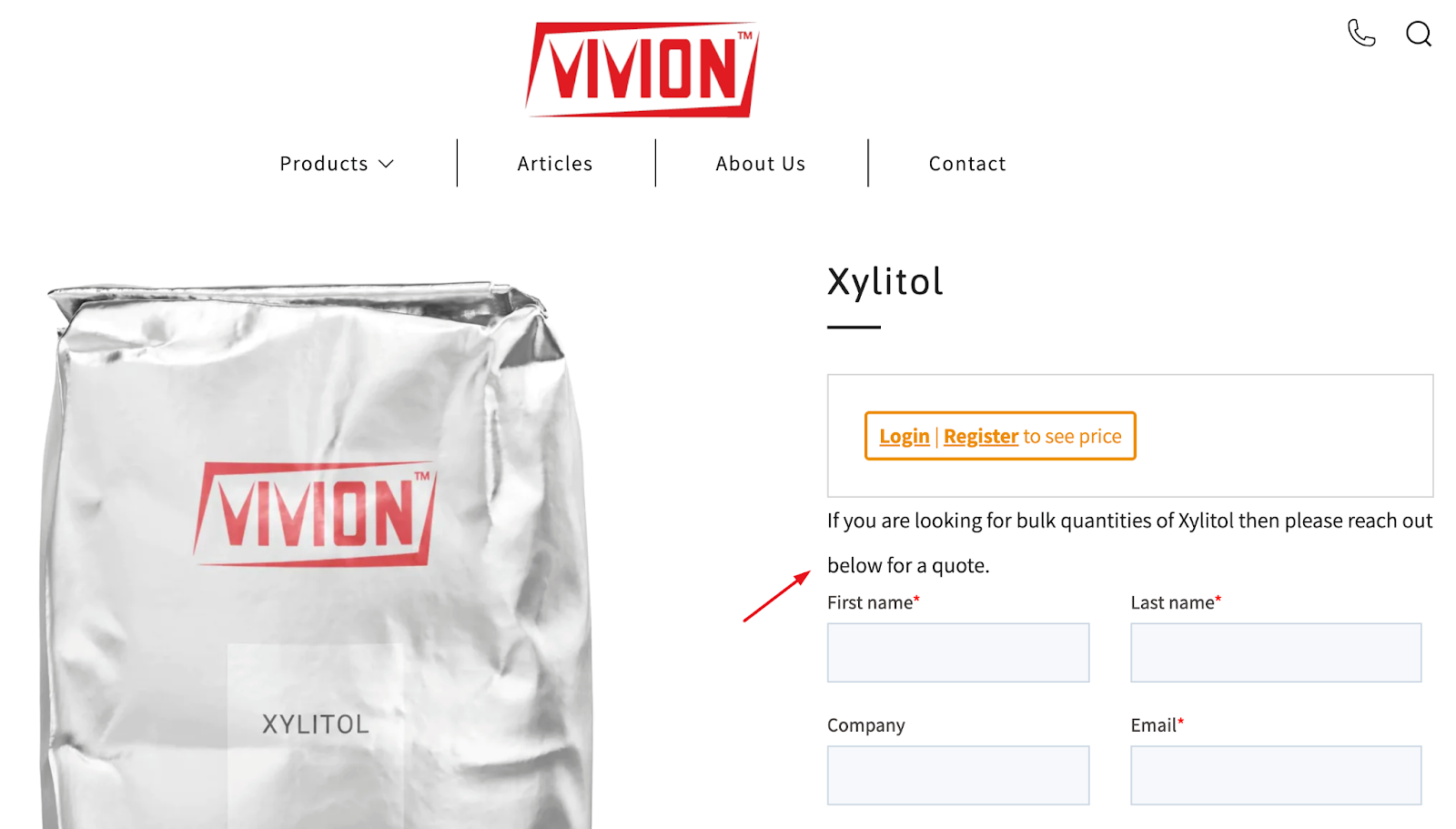
There is also an “ask an expert” option, designed for customers who need a bit more help. It lets them ask any additional questions, and the brand has done a great job of underlining its team’s expertise and ability to help, too.
Provide Some Written Guidance
If your product falls into that middle category of “not too complex, but not something you buy every day either,” you can help your customers out by providing a short guide on your landing pages.
It doesn’t have to go into too much detail (you can use blog posts for that). All you need to do is help customers choose the right product and understand the difference between the various options you provide. You can also talk about the benefits they can expect or how to put the product to good use.
This driveway and traffic mirror page is a great example of how this can be done effectively. It explains what the product is, how it works, where it should be placed, and what the benefits of owning one are.
The brand has found a nice combination of jargon and everyday language that their ideal customer will understand. Since they are probably drivers but also probably not experts in road safety, the way products are described makes it easy to understand where they should be placed, without sounding too basic.
Speak Their Language
In order to truly design a landing page that will appeal to your ideal customer, you need to nail their language, in every sense of that word.
You need to know how much they already know about the pain point and the solution you provide. Depending on the nature of your product, this may mean you have to offer more or less guidance.
You also need to nail the visual elements of the page and evoke the right kind of emotional response. You want your customers to feel a certain way about your products: reassured and safe, for example. Or you might want to put them in a silly mood and make them laugh.
Here’s a witty example. This pouf cat bed page features a clearly photoshopped image of a cat lying on the cat bed. The photo is quite likely to make the customer chuckle, even though they know no cat would ever lie on their bed quite like that, with that quizzical expression.
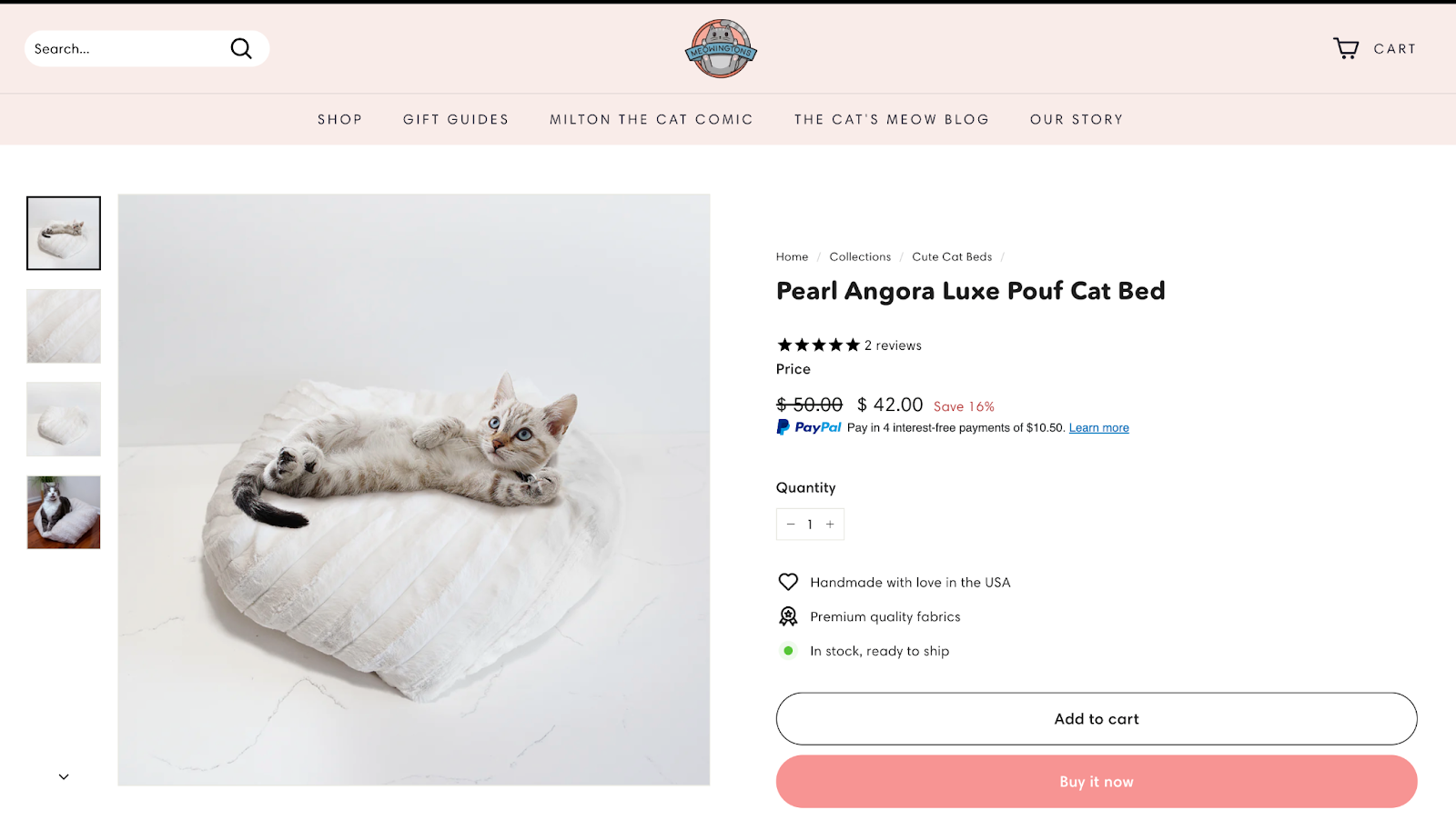
The image carousel also features a photo of a real cat lying on the real cat bed, incidentally also with a funny expression, so you can’t fault the brand for using false imagery.
With this one image, the brand has proven that it speaks its audience’s language and understands them well. Cat lovers appreciate this kind of humor and will like the effort put into it.
Show Them You Care about the Same Things
Another great way to establish rapport with your audience and create a page that aligns with your ideal customer’s needs is to consider what they care about. What is it that makes them want to buy your product over someone else’s? What causes do they care about?
If you can reinforce your brand’s appeal through your charitable work or the difference you are trying to make in the world, your ideal customer who cares about the same issues will feel more connected to your product and overall brand.
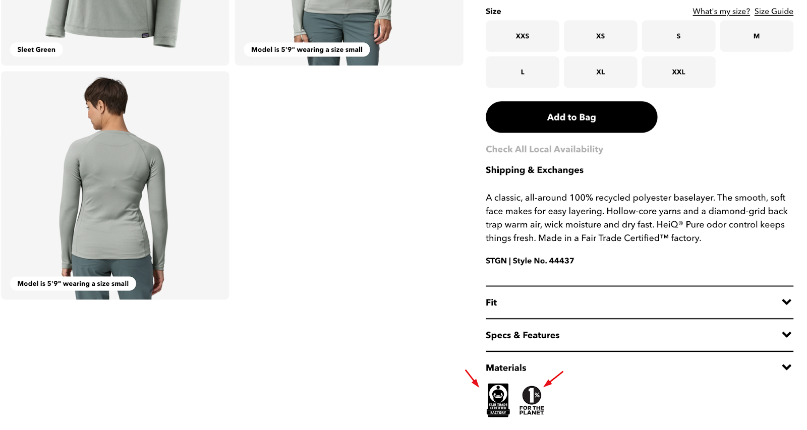
Patagonia is a brand that firmly stands behind its eco-conscious choices. They have several campaigns for the planet, which they clearly highlight on their product pages, too. For example, this women’s crewneck shirt page clearly shows that it was made as part of the brand’s fair trade program and that buying it makes you a part of their 1% For The Planet campaign.
Make sure not to use your ideal customer’s passions in an insincere way. If you aren’t as invested in the causes you claim to support as they are, it will show, and it will end up alienating your customers.
Wrapping Up
Have you already applied some of these tips to the design of your product pages? Or do you plan on making them a part of your content marketing strategy soon? As always, make sure to carefully consider who your ideal customer is and what they are most likely to be looking for.
Don’t forget to revise your ideal customer profiles from time to time. As you gather more information about them, you’ll be able to intelligently tweak your marketing approach.