New and improved look of Price2Spy charts!
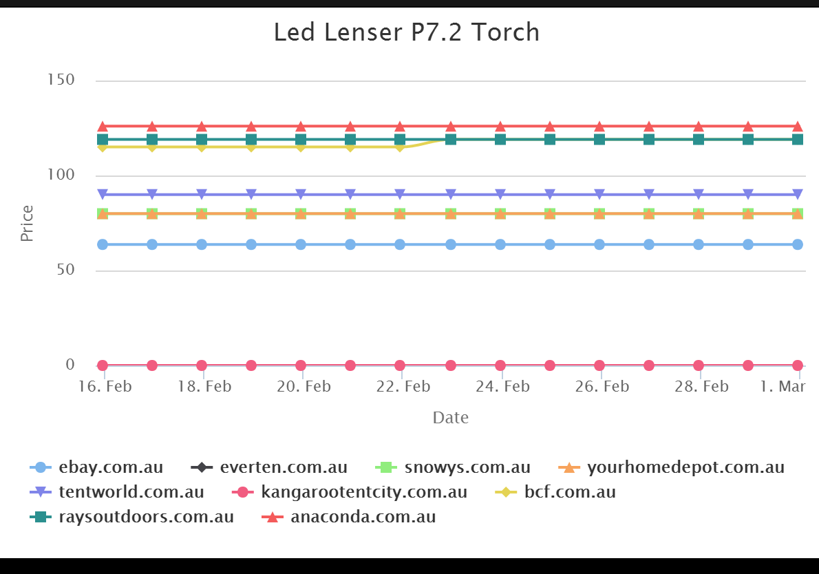
Since Price2Spy is an ever-evolving tool, we decided to revamp the look of our charts a bit. If you go to My Products, pick one product and scroll down to Show Chart, you can see the improved chart that will look something like this:
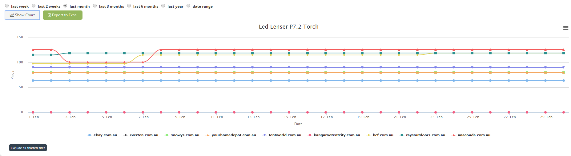
So, you can still filter the desired period – I chose last month – but as we can see the lines that represent the competitor websites are different. Each line is divided into sections, each section representing a day. If we exclude some of the sites, we can focus on one line and take a closer look:
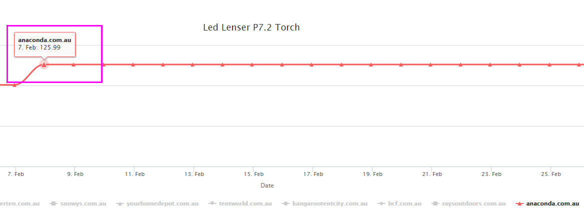
The small triangles divide the red line into segments – days. Beside this new feature, if you hover with your mouse over a triangle, a bubble will pop up with more details – so we can see the date and the price on that date.
The segments make it easier for the client to analyze the chart more precisely and get a clear picture of when the price went up or down.
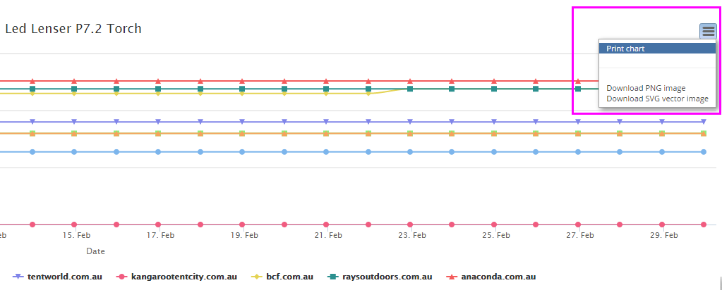
As usual, you can export a chart to Excel. Also, if you prefer graphic form of pricing analysis to the Excel tables, take a look at the top right corner of the chart, and you will notice a button. Clicking on it gives us additional options which offer you offline analysis of pricing data:
- print chart
- download PNG image
- download SVG vector image
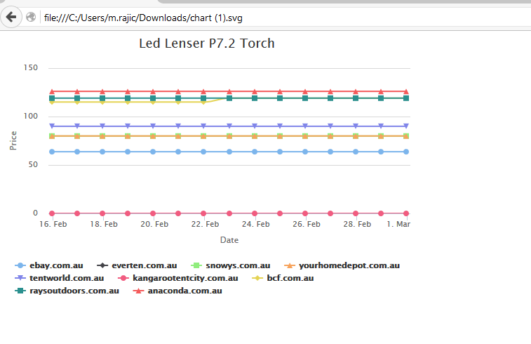
The chart saved as a PNG image will look like this:
While the chart saved as a SVG vector image would look like this:
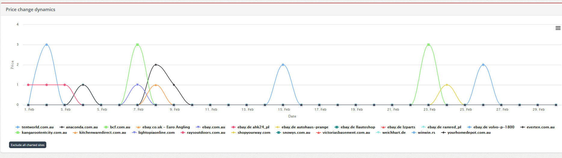
The graphical appearance is also similar for Price Change Dynamics report:
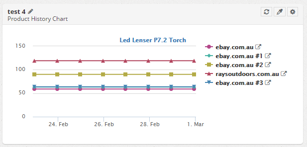
The same goes for the widgets on Dashboard:
We hope that these small touch-ups will help you read your charts more simply and that you will find the new options for chart download useful.
What do you think? Drop us a line in the comments section!