9 eCommerce Design Mistakes That Kill Conversions (and What to do Instead)

In the era of practically unlimited online choice, it can be extremely difficult to stand out and convert visitors, even when you have a superior product or service. Customers tend to bounce quickly when they visit a website for the first time — and a lot of those quick exits have to do with poor website design.
Many online stores make the same kinds of mistakes. They fail to consider the needs of their audience and what most of the modern web looks like. Consequently, they fail to capitalize on some rather obvious and more or less easy wins. In no particular order, here are the most common conversion-killing mistakes and how to avoid them.
Not Being Mobile-First
Mobile-first indexing has been around for nearly half a decade. Yet, many websites still choose to either be merely responsive or completely ignore their mobile users. Since mobile traffic accounts for around half of all internet traffic, this is a major missed opportunity.
Don’t just adapt your desktop website to a smaller screen. Design a mobile experience that takes into account thumb placement, scrolling, and mobile zooming.
Etsy has done a marvelous job of taking into account exactly what its audience wants to see and how it can best deliver a seamless experience. Nothing on any of their pages is hard to reach, the CTA buttons are the right size, and the site loads like a charm. That brings us to our next point: loading speed.
Compromising Loading Speeds
If you choose to sacrifice loading times on the altar of extra-high-quality images or homepage videos, you will effectively be killing your potential conversion rate.
Speed is a ranking factor, for one. The same rules apply to both mobile and desktop versions: never sacrifice loading speed for the sake of design. Find a way to minify your images and code.
Sephora, a major eCommerce name that carries hundreds of thousands of products, has managed to balance fast loading times with usability and cutting-edge design.
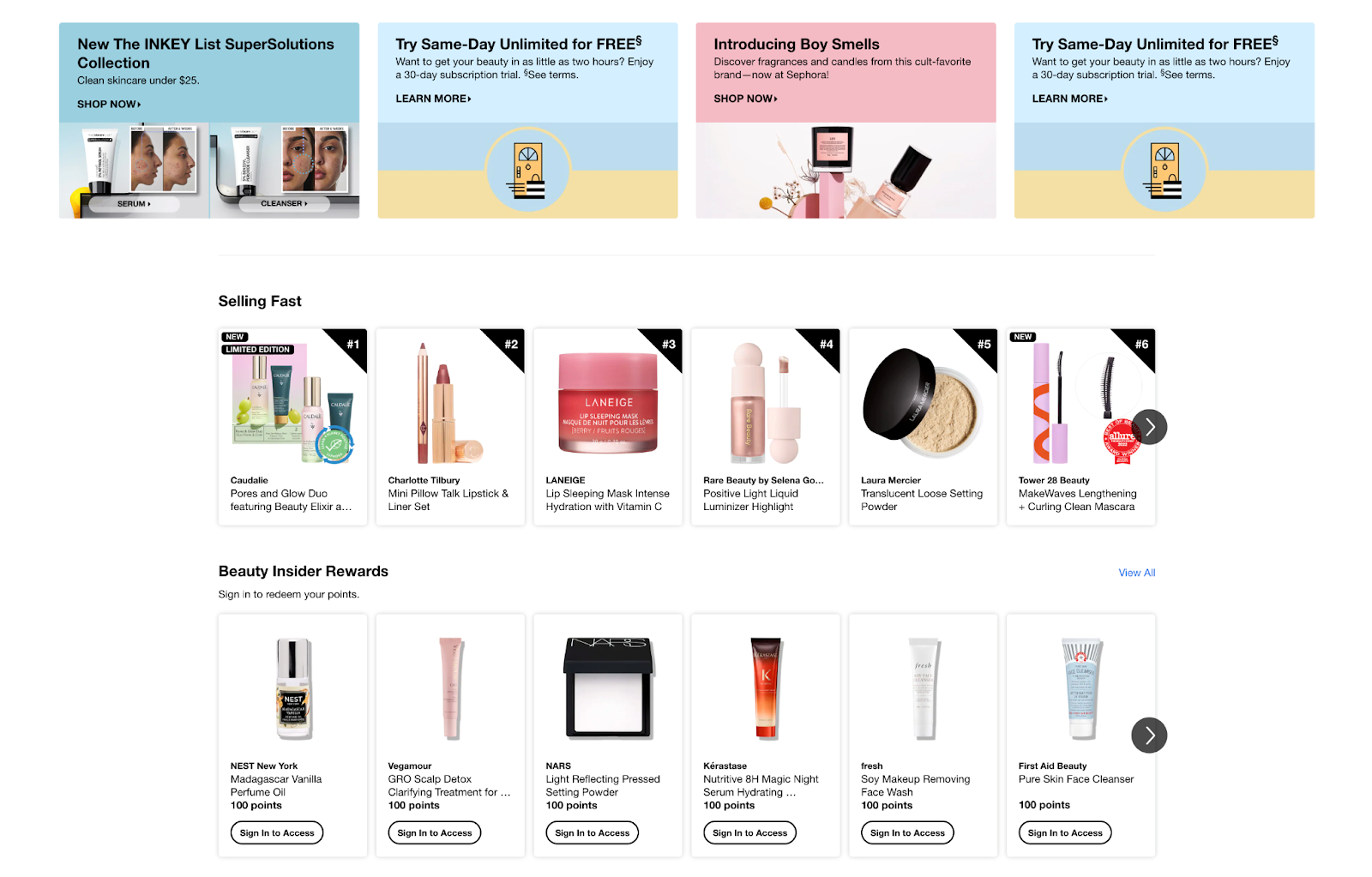
They’re proof that you don’t need to load gigabytes of data.
Making It Difficult to Navigate
No matter how many pages you have, your eCommerce website needs to be easy to navigate. You can use a mega menu if you have dozens of categories and subcategories. Don’t use a mobile menu on a desktop site. It seems to be an ongoing trend, but it’s actually quite confusing.
Highlight your key pages in the menu. Kopi Luwak Direct, for example, points you directly to their shop. Plus, they’ve made the rest of their pages very easy to find and navigate as well.

Use breadcrumbs to help users return to where they’ve just been, and make sure you have a clearly visible search bar.
Omitting Social Proof
Social proof in the form of reviews, testimonials, and user-generated content often speaks much louder than any sales copy you could create. As your customers have no reason to lie about the quality of your products, first-time visitors will believe them more than they can believe you.
From a design aspect, you have countless ways to incorporate social proof on a page. You can use it in your header, on your signup page, in the footer, and so on — wherever you feel it will be the most impactful.
Although it’s not an eCommerce site per se, Shopify did a great job with social proof. Apart from the testimonials on the homepage, Shopify also has a page dedicated to customer success stories.

Poorly Formatted Content
Content marketing is an integral part of eCommerce conversion optimization. However, if your blog posts are poorly designed, you won’t get anyone to actually read them.
Take a look at Square’s blog posts:
- They include plenty of negative space.
- There’s a table of contents at the top.
- They break up their posts with bullet points and images.
- The links stand out in vibrant blue color.
Don’t write blocks of text, and don’t expect the content to speak louder than its design. No one will want to read a wall of words when they can find a post that’s easier on the eyes in a matter of clicks.
Using Generic Media
Using stock photography on an eCommerce website is a major no-no. You would presumably have custom images for each product, but don’t use generic media on any of your other pages either.
They will never communicate your values and message as well as custom images will. You won’t stand out at all, as other sites will have used the same photos and videos already.
Hard Graft provides a great example of using custom, bespoke images well. The website is sleek and smooth, while the images are super-high-quality and represent the actual product exceptionally well.

The more angles you’re able to shoot, the better. Also, aim to feature an image of the product in use, which can demonstrate size very well.
Failing to Demonstrate Expertise
The design of your website needs to ensure that your expertise in the field is made obvious. Don’t hide your credentials and proof of work in the footer or somewhere low on the page. Whatever element you can add to prove that you are a brand that users can trust, add it up high.
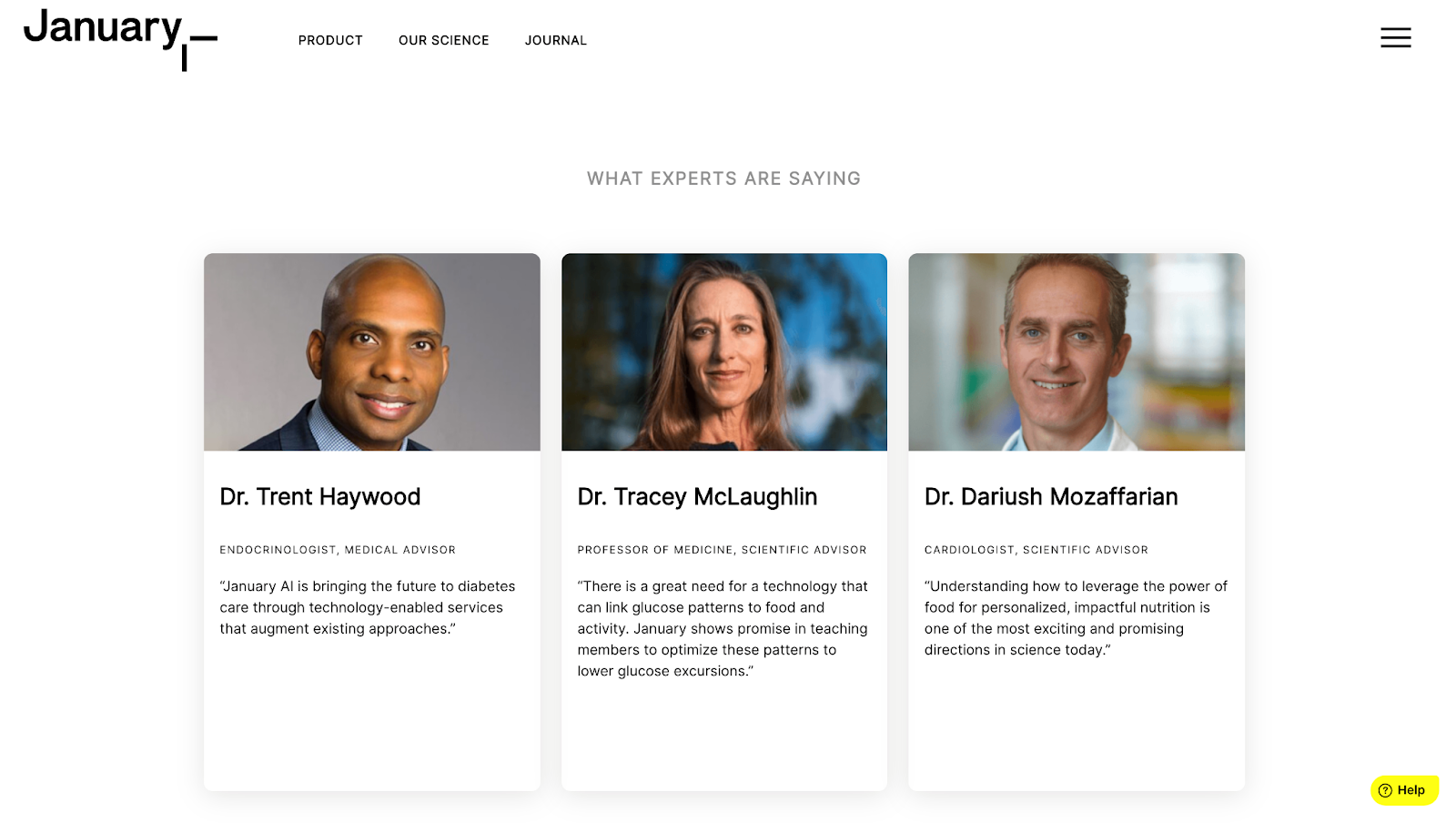
January is a good example here. They’ve highlighted their coverage by major media outlets and showcased expert testimonials. The brand understands very well that its audience will care much more about these two elements than any amount of sales-oriented mumbo-jumbo. Customers want to know that the product works and that the science behind it is sound.
Missing Out on Exit-Intent Popups
Popups can be extremely annoying. However, when you use them intelligently, they can significantly boost your conversion rates. Exit-intent popups that are only shown once are a good way to go. Leads who really want to leave will ignore them, but those who could be swayed will take note.
Kuru Footwear has a good one, which gives you the chance to win a free pair of shoes if you sign up for their newsletter. It’s highly likely to attract a lot of signups, which can eventually be leveraged into conversions. At the same time, it’s not too intrusive.

Failing to Highlight Value
eCommerce is all about value. If your customers don’t see what the value you’re giving is or what you have to offer that other brands don’t, they are not likely to convert.
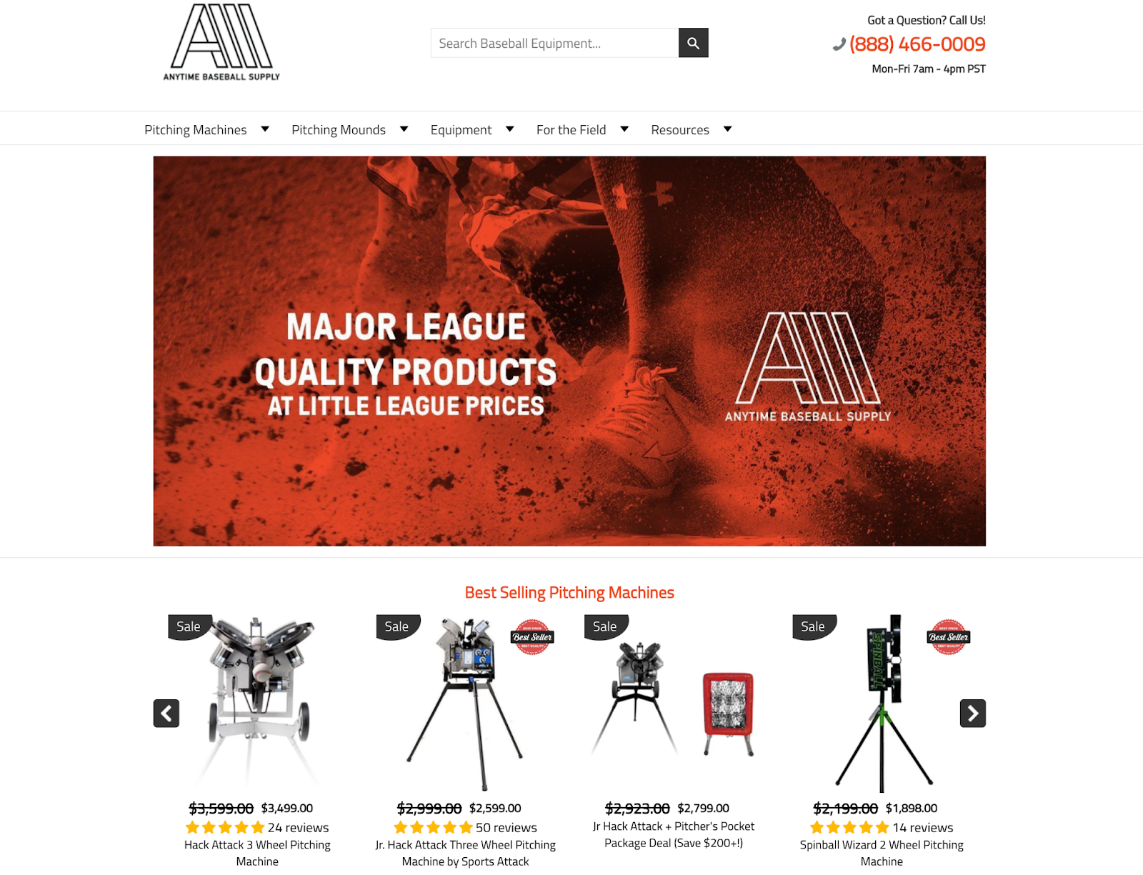
Focus different elements on communicating what’s in it for the customer. Use icons or buttons to highlight the USP, and draw the eye in with the use of vibrant colors. Anytime Baseball Supply, for example, lets their shoppers know how much they will save by making a purchase. This plays with customer FOMO and clearly highlights the value in converting (and converting soon).
Wrapping Up
While it will certainly take time to rectify some of these eCommerce design mistakes, once you do, you can expect to see a boost in conversions. Don’t forget to tailor each of these tips to your industry and the specific needs of your audience, as well as the overall layout of your website.