Designing Product Category Pages: Best Practices for 2023
There are hundreds of articles available telling you how to improve your product pages: how to write better product descriptions, how to create better sales funnels, and how to take better product images.
However, selling doesn’t only happen on product pages. In fact, shoppers will look at your product category pages in a very similar way. They are a crucial part of any buyer’s journey, and they’re potentially the first time a customer can engage with your products. Don’t underestimate their importance.
Here are seven tactics to help you maximize your chance of making a sale by using your eCommerce category pages.
Enable Multiple Product Views
If you have taken the time to research product image best practices, you already know that customers will want to see more than one photo of every product. They will want to see different angles, closeups, the product being used, the product being shown next to a familiar item for size reference, and so on.
This same principle also applies to product category pages. You don’t want to make a customer click on a product to be able to see it from several angles. You want to provide a “window shopping” effect, i.e., let the customer get to know the product and see as much of it as possible without having to navigate away from the page.
Let’s look at a category page example from Gili Sports. Their inflatable paddle boards category page shows you what each paddle board kit looks like when you hover over the various color options available. You get to see the product from various angles, and you also get to see the logo that will be emblazoned on it.
The best thing about this effect is how quick it is. There is no reloading of the page and no need to open a small, quick-view window. The shopper is instantly shown what the product is expected to look like, so they can factor appearance into their choice instantly.

H&M does something similar with their category pages. Take a look at their dresses, for example. You are first shown a photo of a model wearing the item, and when you hover over the photo, you can see what the dress looks like against a white background.
This is an amazing way to show the item “in use” and strip all the extra layers away and just show the product. Shoppers want to see both of these images, so showing them on the product category page is an excellent tactic.
Educate Your Shoppers on the Category
Another element you should feature on your product category pages is a bit of context. You want to tell customers what the products are, how they solve a particular pain point, how they’ve been made, and what’s so special about them.
Adding some helpful, well-written, and well-optimized content to these pages is beneficial because it:
- helps shoppers understand what the products are and how they can be used
- reduces pre-sales interactions
- boosts customer satisfaction rates
- reduces the chance of a return
- is great for SEO
The trick is not to overwhelm your customers with too much information. Start by showing the product, and place the copy at the bottom of the page. Don’t show too many items on one product category page: you want visitors to scroll to the bottom and see page 2 so that they can also see your text.
Aim to be as helpful and as relevant as you can. Choose relevant keywords, but don’t overoptimize. Write specifically for your shoppers, and help them choose a product.
Dress Forms USA did a great job with their category description. Take a look at their professional dress forms page.
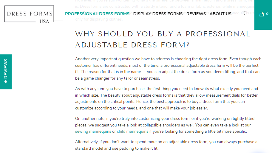
They then explain what a dress form is, how it can be used, and what the benefits of owning one are. They talk about their own products only at the very end, having first focused on promoting their usefulness.
Address Common Conversion Obstacles Early
Shoppers will come to you with numerous conversion obstacles on their minds. They will be wondering about the price, shipping rates, returns policy, the quality of the product, whether or not it will solve their specific need, etc. If you make them overcome these hurdles on their own, you will significantly reduce your conversion rates.
Don’t wait for customers to land on a product page before addressing these issues. The sooner you can assuage their fears, the better. You want them in the right frame of mind: a trusting, generous frame of mind that is ready to find the product they have been looking for.
The product category page design elements you should consider for this task are social proof and FAQs.
Social proof will speak to your trustworthiness and the quality of your product and service. FAQs are the most straightforward way to directly answer the questions probably on the minds of most of your shoppers.
Here’s a great category page example that features both. Bay Alarm Medical nailed the FAQ section on their medical alerts collections page, where they provide clear answers to the most relevant customer questions: Are there hidden fees, is the service covered by insurance, how can it be set up, what if you want to return your alarm system?
They also have a Google ratings carousel that proves they provide quality service and that they’re constantly seeing an influx of customers, as some of their reviews are only a day old.

Offer Multiple Sub-Categories
How you organize your eCommerce category pages will also directly impact both user experience and SEO. Ideally, you want to create several logical sub-categories that will allow visitors to sift through precisely what they need.
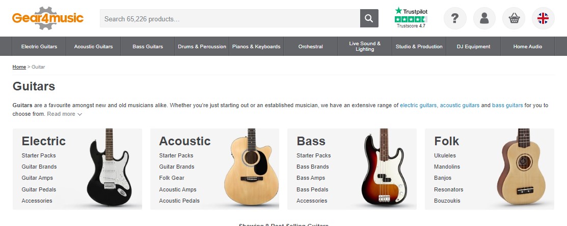
Let’s look at an example to illustrate this point. Gear4Music sells, among other things, a large variety of guitars. They have one main guitar category page, where you can see their most famous guitars and amps. This is also where you’ll get a general idea of the brands they stock and the prices they charge.
They also have a brilliant breakdown of sub-categories at the top of the page. You can choose to look at electric, acoustic, or bass guitars, and they even have a folk guitar section. If you then choose to look at acoustic guitars, for example, you are shown the brand you can explore. You’ll see a very comprehensive filtering system that will help you find exactly the kind of guitar you need for your skill level and preferences.
This is the kind of categorization you’re looking for. Pour a lot of effort into all levels of category pages and make them all helpful and easy to navigate.
Provide Advanced Filtering Options
Speaking of making category pages easy to navigate and intuitive, make sure the products in each category can be filtered in numerous ways. Don’t just offer the “sort by price” and “brand name” filters. Go into the nitty gritty details and help customers locate precisely the item they want in as little time as possible.
You need to tick two boxes here. First, you want to cater to the casual browser, who just wants to see everything that is available in a certain product category. These are the shoppers who are still high up in the sales funnel and who would like to see and compare a lot.
Secondly, you also want to cater to those who know exactly what they want and aim to spend as little time finding it as possible.
Category page filters help you do both. Look at the Sohomod coffee tables category page. They have 627 items in total, and you can slice and dice them with 15 different filters. Looking for a square brown glass coffee table? You can find three of them in a matter of seconds. Looking for a rustic coffee table but not sure about the specifics? Not a problem.
This kind of attention to detail takes user experience to completely new levels and ensures your customers see you as a brand they can rely on, a brand that has their interests at heart. It’s a very simple (albeit time-consuming) category page design element to add, but it’s well worth it.

Provide Key Product Details
Product category pages should also feature essential information about each product. Sometimes this will be a simple matter of “available in sizes XXS to XXL,” but more complex products will demand more extensive product descriptions.
Your goal here is to help shoppers choose a limited number of products they want to compare. You don’t want to make them click on dozens of pages, open all of them in new tabs, and then have to do the work manually.
You want them to have access to all the relevant information at a glance, right from the product category page. This saves them time and directly impacts conversion rates.
HP has done a brilliant job on its category pages. For example, their ready-to-ship category shows you all the important components a laptop has. You can see the processor; you can see what kind of RAM memory you will be working with as well as the storage capacities and the quality of the screen.
You can also select four models to compare, and you’ll be taken to a new page where all the features of each model are broken down in a table, ready for you to dissect.
When writing product descriptions for category pages, focus on the key information about each: what differentiates them from each other, and what does a customer need to make a purchasing decision?

Offer a Quick View Option
If you choose not to go down the product description on the category page route, make sure to include a quick view option. It serves the same purpose as some of the tactics we’ve mentioned above: it helps visitors stay on one page and gather relevant information about various products.
Think of the quick view as a mini version of the actual product page. You want a description; you also want to feature as many images as you can and show any similar products of different colors available.
The quick view is a bridge between the category and the product page.
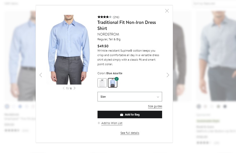
Nordstrom has done a great job applying this tactic. Look at their men’s dress shirts category page as an example. The quick view gives you access to a brief description of the shirt, which then tells you what it’s made of, which colors it’s available in, and what the fit is like. It also shows you 5-6 new images.
You can add the item to your cart or wishlist from the quick view and go right back to browsing without ever having to navigate away from the category page: effective and efficient.
Wrapping Up
Consider these tactics for improving your product category pages and make them the conversion heroes they genuinely deserve to be. Don’t force your customers to wander around your website looking for the right product. Make finding it enjoyable and easy.