Price Dynamics – new report introduced in Price2Spy
With an ever-growing number of Price2Spy clients, we keep getting a steady stream of fresh ideas for tool enhancements. One such idea (originally coming from a client of ours) is Price Dynamics chart.
Price Dynamics, a new report introduced in Price2Spy, is a chart that enables clients to see the price increase / decrease dynamics over time.This new report will ask you to specify
- Date range – possible to chose among the periods given or set the wanted date range;
- Dynamics report type – price increase / decrease and product availability / unavailability.
The report is represented by XY coordinates – Y, vertical axis is showing the number of products affected and X, horizontal axis is showing dates. Each site being represented by a colour, the client gets a graphic picture of the date when a specified price / availability change occurred for a specific number of products on which competitor site.
Why is that important? Depending on your business, there could be a number of reasons:
- Not only does it show changes that occurred on competitors’ sites, but it also shows important dates of price changes. Clients get a clear idea of whether the competitor changes prices at frequent intervals or chooses particular time of the week or month to do so.
- Price change dynamics report enables online store owners to track dates of availability changes at their competitors as well. This feature is of particular importance for clients wanting to know whether a competitor had sudden ‘bursts’ on demand for some products, so the competitor went from several items in stock to unavailable. Or after quite some time of being unavailable, an item becomes available. Is it back in trend, so the competitor decided to have it back in offer?
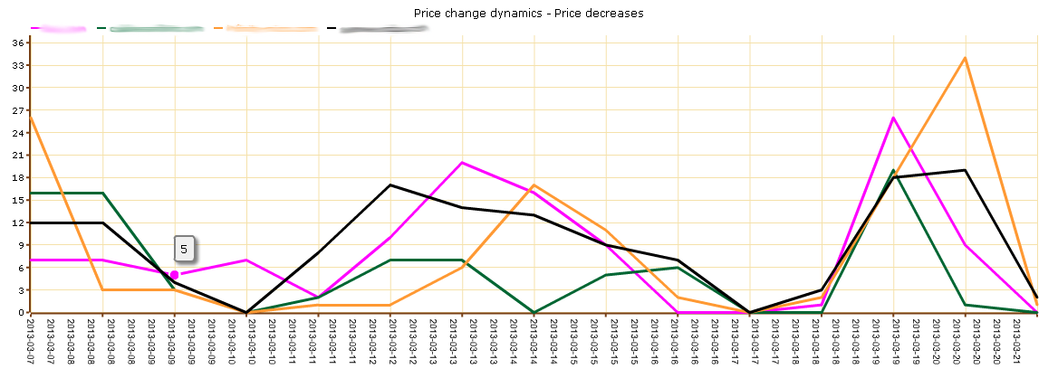
The image above shows price decrease for 4 competitors within 2 weeks. To help you understand the chart we are going to analyze the competitor represented by orange line.
- The beginning of the chart shows that the competitor had made quite some changes on Mar-7 – 27 price drops.
- The period from Mar-8 to Mar-13 could be called a calm, steady period with only up to 6 changes.
- Mar-13 is when price drops start to grow in number – only to culminate on Mar-14 (15 price drops) after which a steady period comes along again – until Mar-20 – a date with over 30 price drops.
What we can conclude is the following:
- The competitor does not change prices in bulks daily, but more or less weekly or even once in two weeks.
- There were some minor price drops for just a few products in the meanwhile, but major price changes occurred just twice in 2 weeks according to the chart.
Different clients find their ways to monitor trends at their competitors’ sites, and each of them focuses on particular group of products / prices / brand, etc. What Price2Spy does is make it easy and simple for them to spot changes occurring within their field of interest. And that is only possible if communicating with clients and striving to meet their needs.
Hopefully you’ll like this new chart. If you have any ideas on how to further enhance Price2Spy in order to make even better tool for online merchants – please let us know – your suggestion are always welcome.