Product Page Best Practices for Rookie Online Retailers
Launching an online store, while fraught with many challenges, can be a very rewarding and creative process. It’s not just about the technical stuff, and alongside finding the best inventory tracker come tasks like writing product descriptions and choosing the best photos.
In the world of eCommerce and online retail, each individual product page is of unsurpassable importance. True, your homepage needs to inspire clicks and make visitors want to stay, however, the product page is where all the conversion actually happens.
By implementing the best practices we are about to discuss and constantly A/B testing the effectiveness of your product pages, you can over time find a formula that works for your target audience, and experience steady, sustainable growth.
Use Visually Striking CTAs
One of the most important elements of a product page is the CTA. While relatively small, it gives you plenty of room to get creative, stand out, and increase your conversion rates.
CTA best practices are simple and straightforward:
- Use a striking color, but one that is still complementary to the rest of the page. This will make the CTA more noticeable, but also ensure there is cohesion with the overall design of the website.
- Use action-oriented words as a label. The more you are able to personalize them, the better. Words like “you” or “yours”, even “me” and “mine” can be much more effective than a generic “buy now” or “add to cart” label.
When designing a CTA, make sure to try out different shapes and sizes on the actual page. Save your favorites and run several A/B tests, as soon as you amass a large enough audience.
The CTA to focus on the most is the purchasing CTA. If there are others on the page, make sure they are not exactly the same. You don’t want the same button to lead to your newsletter signup form, contact page, and shopping cart.
Embrace Explainer Videos
Video is the most popular content format on the internet. And while this stat has much more to do with video for entertainment purposes, there is a way you can utilize it for your own marketing purposes.
If your product is very unique and complex, an explainer video on your product page can significantly increase your conversion rates. According to the Wyzowl State of Video Marketing report for 2021, 94% of marketers claim video marketing has helped their users better understand their product or service.
Even if you are not selling an overly complex product, an explainer video can help you showcase the abilities of the product and ensure more people are interested enough to convert.
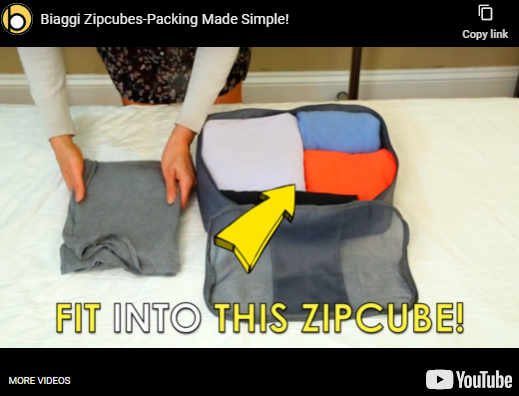
A good example is Biaggi’s video on packing tips. While most of their shoppers will presumably know how to use a packing cube, the video offers some helpful tips and shows you how to make the most of the product and how useful and compact it is.
Do your best to preempt all the possible questions your customers may have about your product. Don’t focus on making a sale: focus on providing information.
Trigger FOMO and a Sense of Urgency
Provoking a sense of urgency on your product pages and trying to play the FOMO card can also help you convert more visitors. You will however make sure not to play it too often. If you keep making your audience feel bad because they keep missing out on deals, or if they feel anxious about shopping with you, your original strategy will backfire.
Some of the ways to utilize FOMO are to highlight low stock levels or display how many items you still have left in stock. This will require you to connect your inventory management solution with your eCommerce platform (unless you use the same tool for managing both).
You can also let shoppers know what others have purchased, highlighting other interesting stock. Of course, you can just have a sale, that’s still a FOMO tactic.
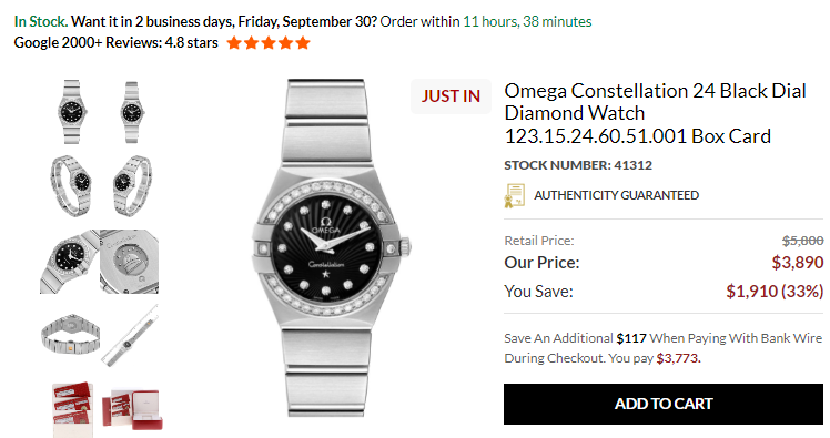
Take a look at the Swiss Watch Expo Omega Constellation 24 product page. They let you know how much you save when shopping with them, as opposed to looking at the same product with another retailer. Since their stock is limited and they only have a limited amount of each model, customers will be much more likely to shop and shop soon.
They also mention the date that delivery will be received if the shopper makes the purchase within a specified amount of time – this time represented as a countdown timer to create even more urgency with the shopper.
Answer Shopper Questions Publicly
A lot of shoppers will have questions about your product. While they can certainly contact your customer service representatives, if you provide a public space for questions and answers, you can capitalize on both social proof, quality customer service, and share valuable information and educate your customers.
Find a space on your product pages where visitors can ask questions. Answer them thoroughly and in a friendly tone, being as informative as you can without going overboard. Your approach will encourage others to ask questions too, and you will effectively build a valuable community.
Not only can you use this space to promote your products and highlight different aspects, but you can also demonstrate your commitment and care for your customers.
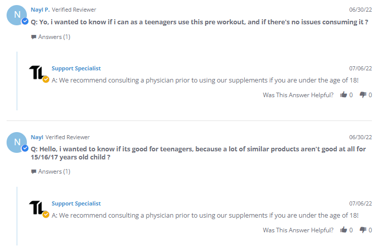
Transparent Labs has a Questions section in their review area as shown in their Bulk Pre-Workout product page below. Here they get questions about specific products, but also questions about the best way to use a product, how to combine several supplements and offer general training advice. This proves they are experts in their field, and that they understand how their supplements complement someone’s workout routine.
Don’t Limit Reviews to Your Product
Social proof is an amazing way to demonstrate expertise and care. People trust it more than they do market copy, as there is no agenda behind it. It’s just a customer reviewing a product.
However, if you are using social proof only to showcase the value of your products, you are missing out on a huge opportunity. Shoppers care about more than the quality of the product itself. They want to know if your deliveries are punctual and if there will be any extra costs. They want to know what your customer service team is like and how quickly they respond.
When you can, include reference to the positive reviews you are getting on more than just the items you sell. If someone has sent you a kind email complimenting your sales team, use it as a testimonial on your product pages.
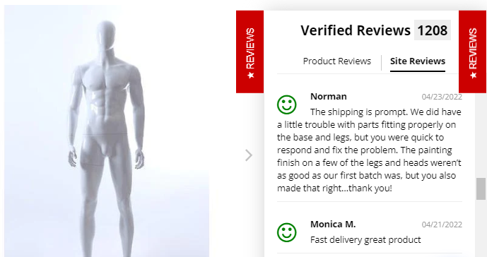
Mannequin Mall has a great feature that highlights these reviews as shown on their Male Abstract Mannequin product page. There’s a “review” flyout on the side that also features “site reviews”, alongside “product reviews”. Here they are able to take credit for their quality customer service and shipping and assure new customers that they are a brand they want to be doing business with.
Address Common Conversion Obstacles
Practically all shoppers will have some concerns about their potential purchase and your business. This has nothing to do with you: it’s natural to feel a bit apprehensive before ordering from a new brand for the first time. There are so many scams out there, customers have learned to be cautious.
They will wonder if your payment methods are truly safe. They will want to know all about the cost of shipping and if they can expect any additional taxes. They will want to know what your return policy is, and who has to pay the cost of that shipping. They will want to know how to contact you if they have any questions.
All of these obstacles to converting should be addressed on the product page itself. You can’t expect customers to go looking for reassurance: you need to provide it. This does not mean you need an “it’s safe to shop with us” section.
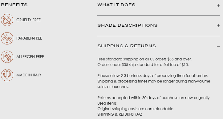
Take a look at the Natasha Denona Bronze Cheek Palette product page. The “benefits” and “ingredients” sections tell you exactly what you can expect from the product. The “shipping and returns” section sums up everything you need to know in that regard. The footer also tells you which payment options are available, and these simple trust badges can go a long way in alleviating a lot of first-time shopper fears.
Enable Simple Product Comparisons
If you have a range of similar products, consider providing a product page where you will explain how the different products compare to each other, and what solution will best suit what type of customer. This will save them a lot of time, as they won’t have to open several tabs and do the comparing themselves.
While it can be difficult to compare your own products against each other, try to focus on the target group for each solution. The most expensive option will of course have the most features, but who would need to purchase the more affordable ones? Aim to write benefit-oriented copy and explain what types of pain points each product solves well.
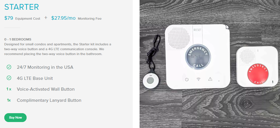
Get Safe has done this very effectively as shown in their Medical Alert Systems pricing page. The page is simple and to the point, and does not overwhelm readers with superfluous information. It gives you all the basic facts and helps you make an educated decision. You can of course do more research on the website, once you know what product best fits your needs.
Supplement User Reviews with User-Generated Content
Finally, aim to provide customers to showcase your products on the website itself. By allowing reviewers to upload photos of your products, either while they are being used or how they fit into their homes, you will significantly boost the value of your product pages.
This is the most effective kind of social proof: while image quality might not always be the best, the value is unsurpassable. It will lend another layer of authenticity to each review, as customers can prove they have purchased a product, and it will help potential shoppers imagine using that same item in their own homes and lives.
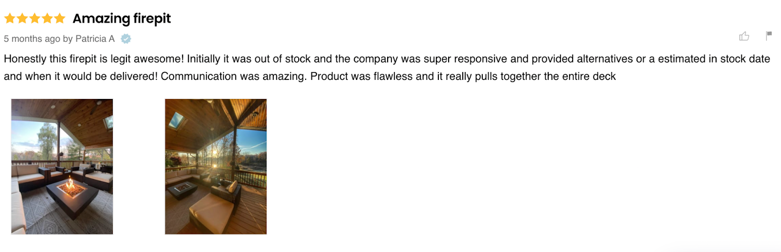
Fire Pit Surplus has this feature as shown on their Modeno Aurora Fire Pit Table product page. You can check out all kinds of different uses of their products before you make a purchase. This allows you to both get a better look and feel of the product and to see it from angles the manufacturer may not have chosen to show it from.
Wrapping It Up
While some of these product page best practices may sound more difficult to implement than others, with a little bit of imagination and research, you can quickly make them a part of your website. As long as you don’t forget to A/B test them regularly, they should prove their merit quite soon.