10 Best eCommerce Product Page Practices for 2024 [+ Examples]
Optimizing your ecommerce product page is more crucial than ever in 2024. With an average cart abandonment rate hovering around 60.7%, it’s evident that every aspect of the customer journey needs to be scrutinized, from the landing product page to checkout.
An effective product page does much more than just showcase an item; it is a pivotal touchpoint in converting visitors into customers. In this article, we will discuss the 10 best eCommerce product page practices with real-world examples that are integral to the success of your online store.
Let’s get started!
High-Quality Product Images and Videos
High-quality images and videos essentially act as your storefront in the digital world—they draw the user in, boost engagement, and foster trust in your brand. Leveraging an AI video generator can significantly enhance the quality and efficiency of your video production. 75% of online shoppers depend on product photos when considering a purchase, demonstrating their critical role in the decision-making process.
Here are some best practices for designing visual content on your ecommerce product page:
- Opt for Multiple Angles: Give customers a complete view of your product with multiple images, including top, sides, and back perspectives.
- Invest in 360-Degree Views: Incorporating 360-degree product images has proven to reduce returns by 4.7% and enhance conversion rates by 2.5%.
- Ensure High Resolution: High-resolution images allow for zooming without losing quality, providing a closer look at textures and details.
- Consistent Lighting and Backgrounds: Maintain uniformity across all product images to create a professional and cohesive look.
- Include Videos On Product Pages When Possible: Video marketingIncluding product page videos can offer a significant boost to conversion rates, providing customers with a clearer understanding of the product.
Brand Examples
ASOS
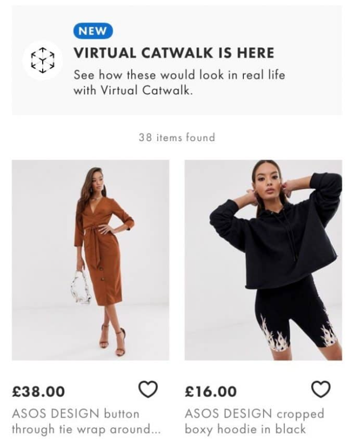
The brand uses catwalk videos to give its customers a realistic sense of how clothing fits and moves, enhancing the online shopping experience.
IKEA

IKEA revolutionizes the customer experience with its augmented reality (AR) feature, allowing customers to visualize furniture placement in their own space before buying.
Detailed and Scannable Product Descriptions
Crafting compelling product descriptions is about balancing detailed information with scannability. Your goal is to provide enough detail to answer customer questions and to help them visualize the product while making the information easy to absorb at a glance.
Here are some key pointers to help you create detailed product descriptions for your ecommerce business:
- Be Descriptive Yet Concise: Aim for clarity to improve understanding. Avoid jargon unless appropriate for your audience.
- Use Bullet Points: Break down key features into bullet points for easy scanning.
- Show the Product in Use: Illustrate how the product fits into the customer’s life, promoting a tangible connection.
- Provide Zoomable Images: Accompany descriptions with high-quality images that can be zoomed in, as this has been shown to enhance the shopping experience.
- Focus on Benefits: Highlight how the product can solve problems or improve the user’s life.
Brand Examples
Amazon
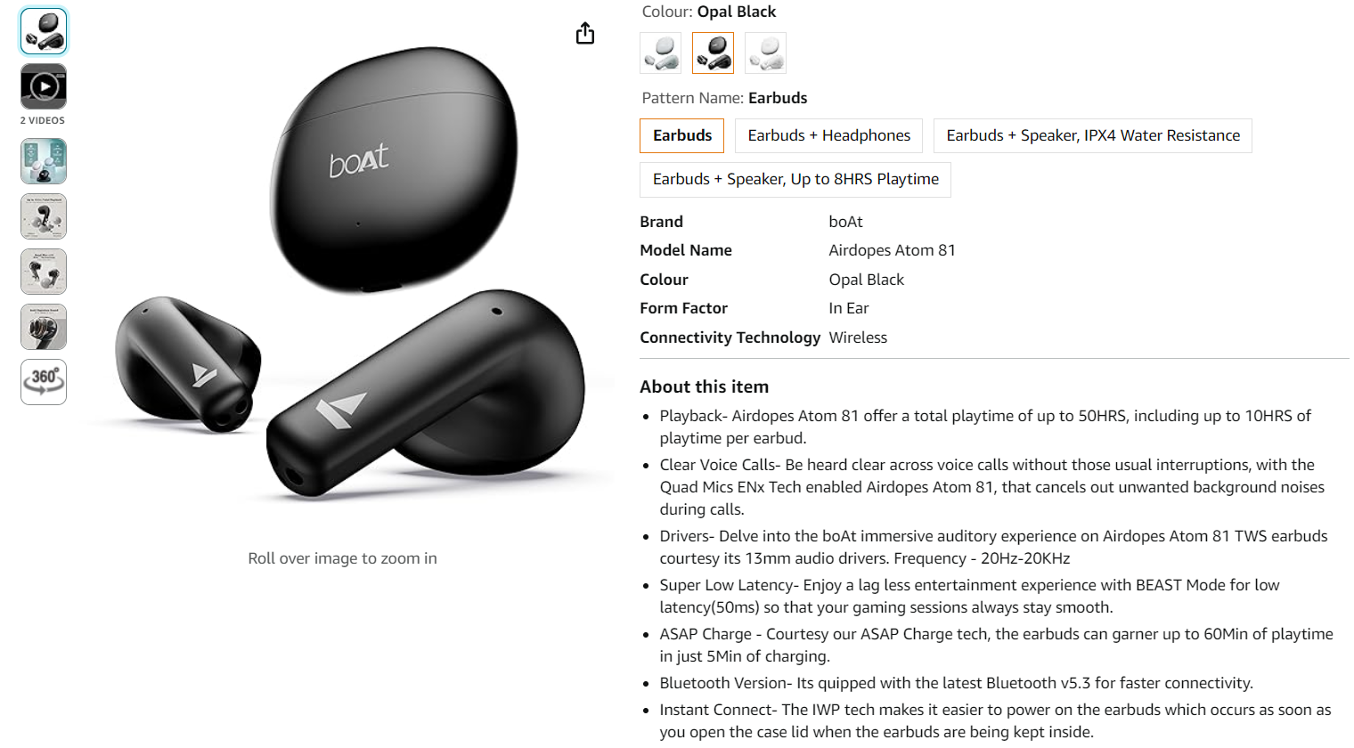
Amazon optimizes its product listings by incorporating bullet points, enabling quick scanning while concisely presenting product specifications. This approach helps customers quickly grasp the key features and benefits of a product, facilitating informed purchase decisions.
Bose
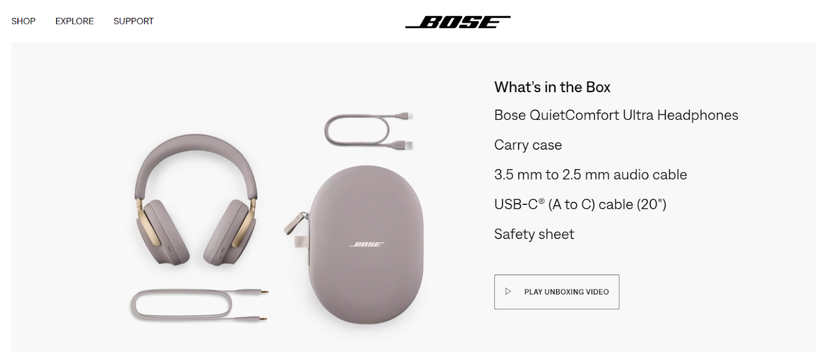
Bose focuses on providing detailed descriptions of its audio equipment, emphasizing superior sound quality. By including technical specifications and compatibility information, Bose ensures that consumers understand the value and practical applications of their products, aiding in the decision-making process.
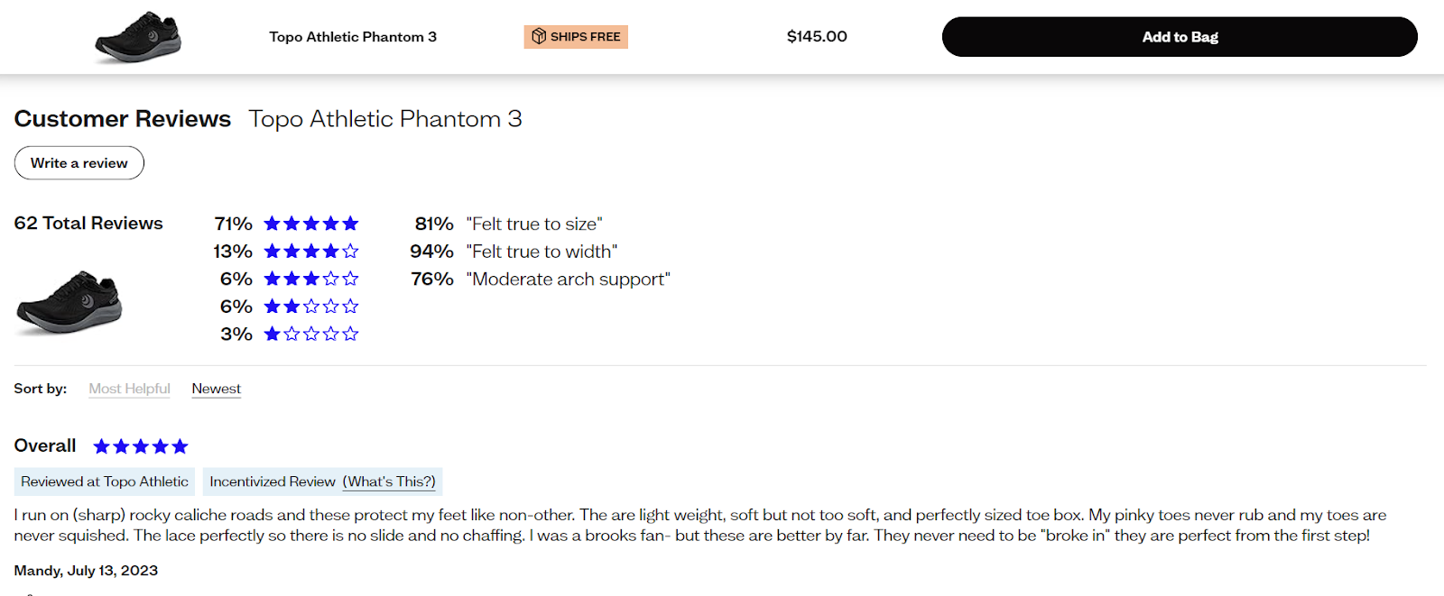
Social Proof and Reviews
Incorporating customer reviews and ratings on your eCommerce product pages serves as a potent form of social proof, building trust and positively influencing shoppers’ decisions. Visitors are keen to see what others say before making a purchase, and prominently displaying this feedback can be the push needed towards conversion.
Here’s how to integrate user photos and videos on your product page:
- Encourage Sharing: Prompt your customers to share photos and videos of them using your product by offering incentives, like discounts or entry into contests.
- Photo Quality: While authenticity is key, provide guidelines to ensure that the user content maintains a standard of quality that matches your brand image.
- Engage with UGC: Actively engage with user-generated content. Showcase stellar customer photos and videos in a dedicated section on your product page.
Brand Examples
Etsy
Etsy is recognized for integrating user reviews with customer photos. This creates a personal touch, and potential buyers can see how products are used in real life.
Zappos
Known for its extensive customer review sections, including those for CES software, Zappos includes detailed feedback, ratings, and stories from buyers, providing a comprehensive view for future customers.
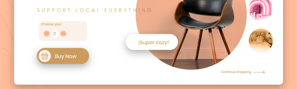
Clear Call-to-Action (CTA) Buttons
When designing your product pages, effective CTAs are essential for guiding customers toward making a purchase. A well-constructed CTA button stands out visually and conveys its message clearly, ensuring customers know exactly what will happen when they click.
Here are some best practices for creating CTAs that are both visually striking and textually clear:
- Visibility: Your CTA should be one of the most prominent features on the page. Use size, color, and position to make sure it’s instantly noticeable.
- Color contrast: Employ contrasting colors for your CTA button to make it stand out from the background and other elements on the page.
- Concise text: The text on your CTA should be brief and action-oriented. Phrases like “Add to Cart” or “Buy Now” are direct and clear.
- Whitespace: Surround your CTA with ample whitespace to draw the user’s eye and reduce visual clutter.
- Consistency: Keep your CTAs consistent across your website to help users recognize the action you want them to take.
Brand Examples
Nike
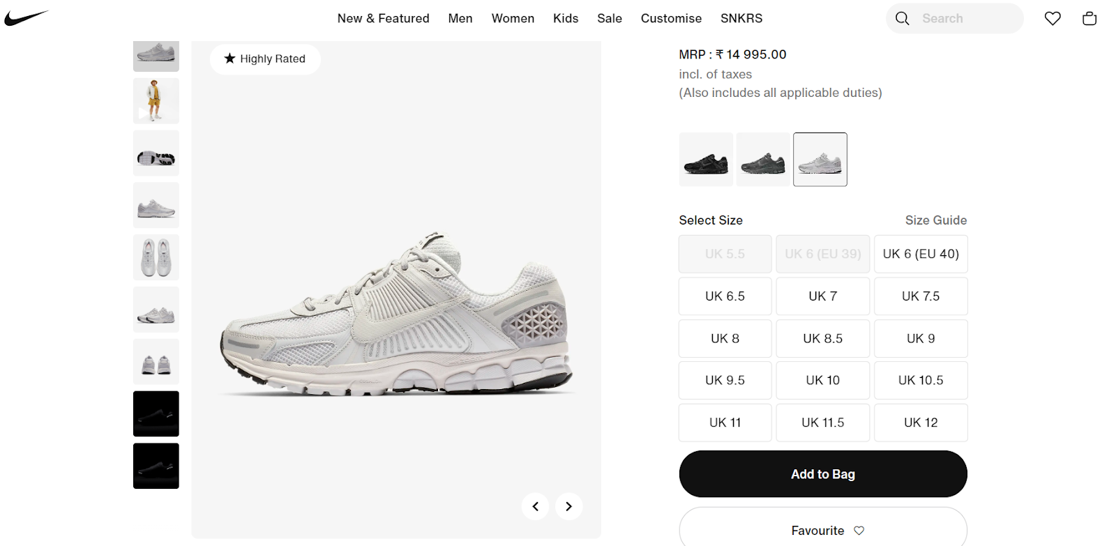
Nike uses prominent “Add to Bag” buttons that catch the eye with their size and black color contrast, making it easy for customers to move to the next step in the purchase process.
Apple
Apple’s approach to CTAs is minimalist. Their clear CTA design cuts through the noise, often using only white text on a plain blue background for a stark, unmistakable presence.
Remember, your CTAs are not just buttons; they’re the signposts that lead your customers from interest to purchase. So, make sure they’re impossible to miss and easy to understand.
Mobile Optimization
Responsive design and fast loading times are non-negotiable for your mobile eCommerce experience. With mobile accounting for 60% of global ecommerce sales, your customers expect seamless functionality across devices. A slow-loading page is a quick way to lose a sale, as ecommerce conversion rates can drop by 0.3% for every extra second a page takes to load.
Here are key best practices to ensure your mobile site meets customer expectations:
- Streamline Your Design: Keep your mobile interface clutter-free. Use large, easily clickable buttons, and prioritize essential information.
- Optimize Images: Compress images to reduce load times while maintaining quality for a visually appealing layout.
- Prioritize Speed: Implement Accelerated Mobile Pages (AMP) to speed up loading, keeping in mind that even a one-second delay can impact conversions.
- Responsive Layout: Use fluid grids and flexible images to ensure your site looks good on any screen size.
- Test Continuously: Regularly test your mobile site across different devices to ensure consistent performance.
Seamless Navigation and User Interface
Simplifying the path to purchase is essential for a positive user experience in eCommerce. Your goal is to guide customers from the landing page to checkout as smoothly and quickly as possible. This means reducing the number of clicks required, streamlining navigation, and providing a logical product discovery process.
Here are tips to enhance navigation and browsing:
- Consistent Navigation: Keep your navigation menu consistent across all pages. This ensures that users always know how to move to the next step or return to a previous one.
- Descriptive Labels: Use clear, descriptive labels for your menus to help users find what they’re looking for without guesswork.
- Search Functionality: Implementing a prominent search bar with advanced filters allows faster product finding.
- Breadcrumb Trails: Help users track their path and easily backtrack if needed.
- Visual Cues: Use visual cues to indicate where users are on the website and how they can proceed to checkout.
Brand Examples
Ulta Beauty
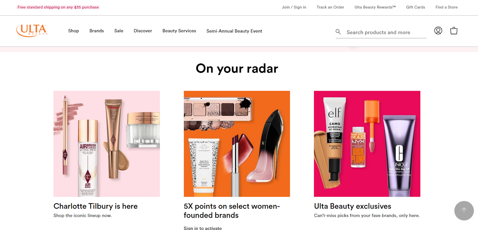
Ulta Beauty allows easy navigation with clear categories and filter options, helping you find products quickly.
Best Buy
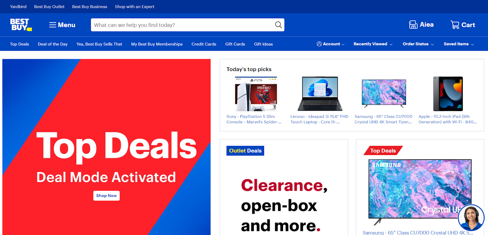
The user-friendly interface and smart layout by Best Buy make product searches and comparisons particularly intuitive for customers.
Your interface should speak of efficiency, aiding users in their shopping journey without any unnecessary complications. Through thoughtful design and consistent user interface elements, you can create an environment that not only pleases the eye but also makes shopping a breeze.
Remember, the fewer barriers between your product and the checkout, the better the user experience will be.
Use of AI and Personalization
When you implement AI on your eCommerce product pages, you introduce a system capable of providing tailored recommendations to your visitors. The integration of AI for recommendations analyzes customer behavior, purchase history, and preferences to suggest products that are more likely to resonate with individual shoppers, enhancing the shopping experience and potentially increasing conversion rates.
To optimize the use of AI for personalizing product recommendations, adhere to these best practices:
- Gather Data: Collect and analyze data from customer interactions across all channels using data science consulting tools.
- Update Regularly: Ensure the AI system learns continually from new data to improve its accuracy.
- Visual Cues: Use visual elements like badges to highlight AI-recommended products.
- Transparency: Explain why items are recommended to build trust.
- Multi-faceted Approach: Combine behavioral data with contextual information for nuanced suggestions.
Brand Examples
Netflix
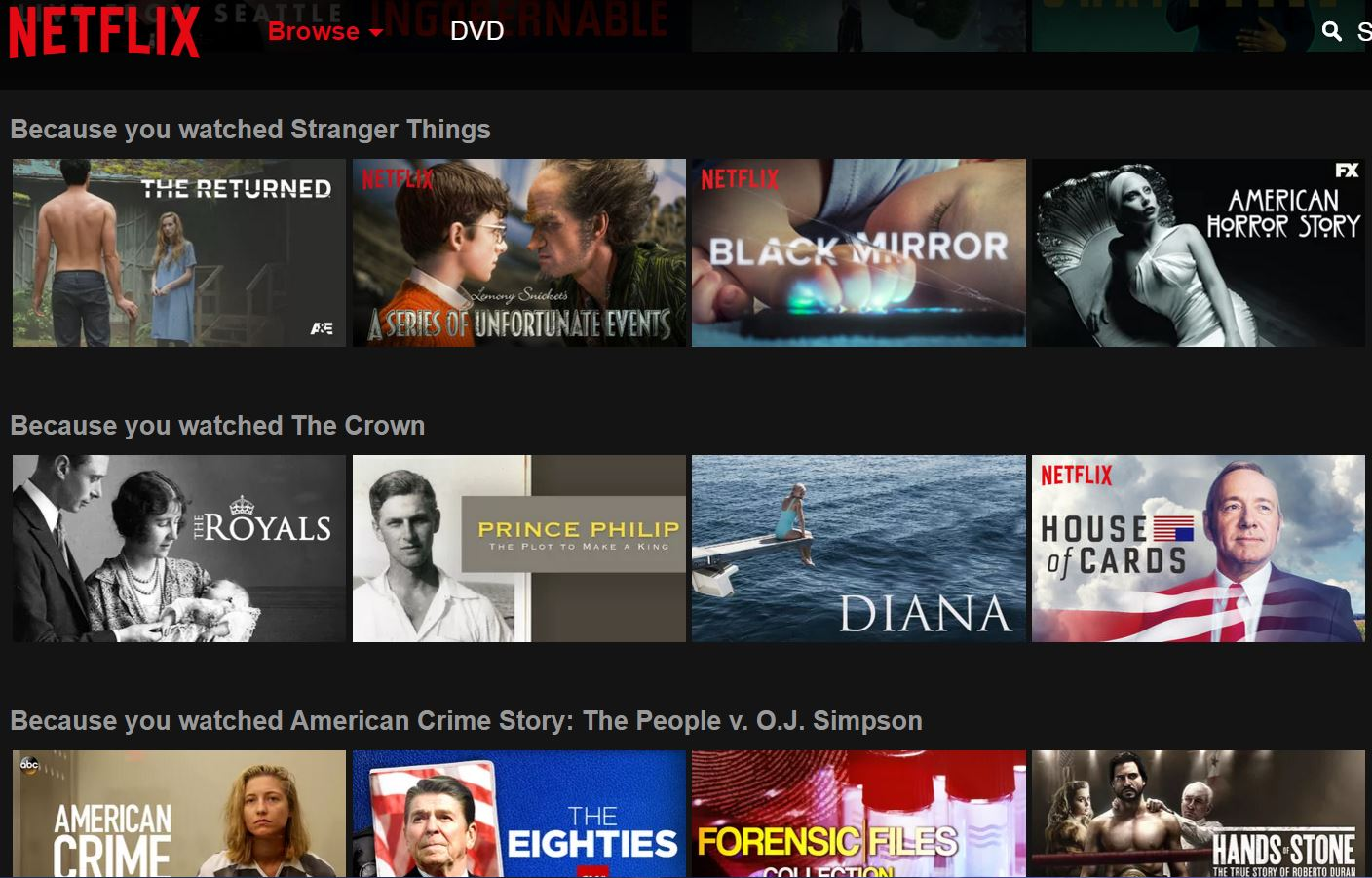
Netflix uses an AI-driven personalized recommendation system to retain viewer interest by suggesting relevant content.
Amazon
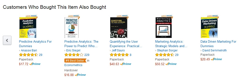
Amazon showcases the power of AI with its “customers also bought” suggestions, serving to cross-sell products and enrich shopping experiences.
Transparency in Pricing and Shipping
When creating an eCommerce product page, transparent communication about pricing, taxes, and shipping costs is crucial. 43% of online shoppers prioritize in-stock availability and swift delivery. Your clarity in pricing and shipping not only nurtures trust but also reduces cart abandonment.
Here are some best practices for eliminating hidden fees:
- Display All Costs Upfront: Clearly list the price, taxes, and any additional fees before the customer reaches checkout to prevent surprises.
- Break Down Costs: Itemize costs on the product page and during checkout so your customers see exactly what they’re paying for.
- Include Shipping Calculator: If shipping varies, provide a calculator or estimate based on the customer’s location.
- Be Clear About Shipping Times: Tie in the importance of fast delivery by transparently stating expected shipping times.
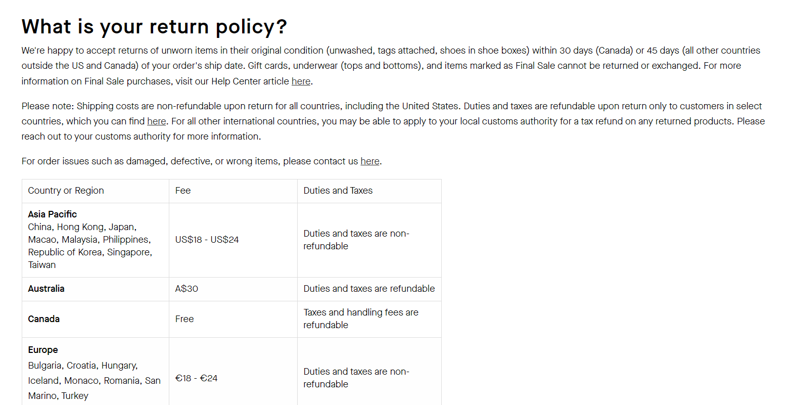
- Easy Access to Return Policies: Ensure your return policy is visible and easily understandable to reassure customers.
Brand Examples
Everlane
Everlane maintains clear shipping and return information on their product pages, ensuring customers are informed.
Remember, with digital and mobile wallets accounting for 45% of eCommerce payments, your pricing and shipping information should also be optimized for mobile users. Being upfront with costs, and having a clear and straightforward shipping policy, will help you gain your customers’ loyalty and increase the likelihood of repeat business.
Interactive and Dynamic Elements
In an e-commerce landscape, enhancing your product pages with interactive and dynamic elements can significantly boost customer engagement. Let’s explore how you can incorporate these features effectively.
- 3D Views for Confidence: Offering 3D images of products can lead to a 250% increase in conversions. It gives customers a comprehensive view and a better sense of the product’s actual size and shape.
- Quizzes for Personalization: Integrate product recommendation quizzes to guide visitors through a personalized shopping journey. This directs them to products that best suit their needs or preferences.
- Size Guides for Assurance: Provide interactive size guides to reduce uncertainties about fit, which is crucial for items like clothing and accessories.
- Color Swatches for Visuals: Employ color swatches that show product variations in real-time, offering a tangible feel for color options.
Brand Examples
Warby Parker

The brand showcases innovation with its virtual try-on feature, which allows customers to see how glasses look on their faces, simulating a real-life try-on experience.
Sephora

At Sephora, shoppers can use color swatch previews to see how makeup shades could appear on their skin, simplifying the decision-making process.
Remember, the goal of integrating these interactive elements is to create an immersive and user-friendly shopping experience that encourages purchases and reduces returns by providing as much information as possible in a dynamic format.
Comprehensive FAQ and Support Sections
Providing a detailed FAQ (Frequently Asked Questions) section and visible support options like live chat, email, and phone support are crucial for an online store. They serve as the first points of contact when a customer needs assistance. This not only demonstrates customer care but also builds trust and can be effective in reducing purchase hesitations.
When curating your FAQ section, consider the following best practices:
- Anticipate Customer Inquiries: Draft questions that directly address common customer concerns and queries.
- Clear Categorization: Organize your FAQs into categories for easier navigation. Use a bold or italic style to differentiate questions from answers.
- Search Functionality: Implement a search bar within the FAQ section to help customers quickly find relevant information.
- Regular Updates: Keep your FAQ content updated with the latest information and questions.
For support channels, ensure they are:
- Easy to Find: Place links or icons for live chat, email, and phone support prominently on your site.
- Responsive: Offer quick response times to show your customers that you value their time.
- Multichannel Support: Provide more than one way for customers to reach you, catering to different preferences.
Brand Examples
Home Depot
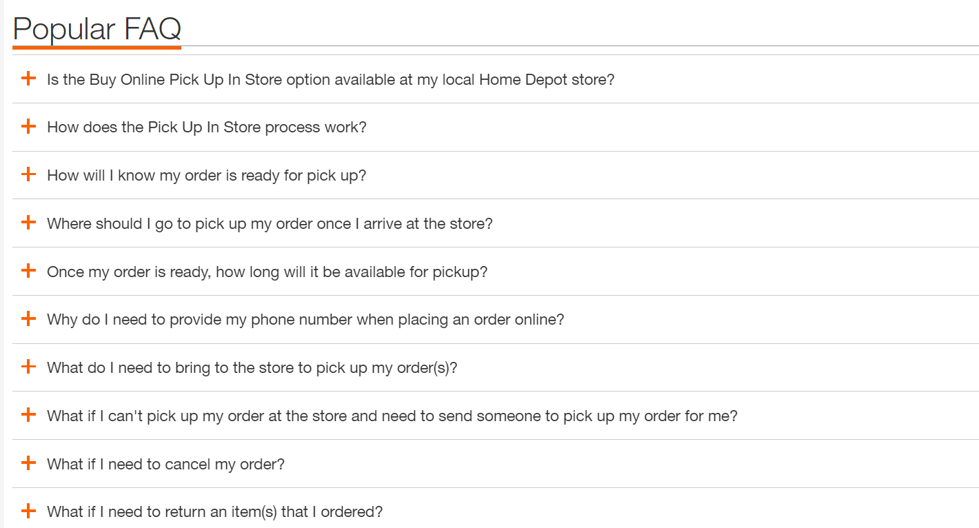
Known for their comprehensive support and FAQ sections that cover a wide range of topics, Home Depot makes it easy for users to find the help they need.
Casper
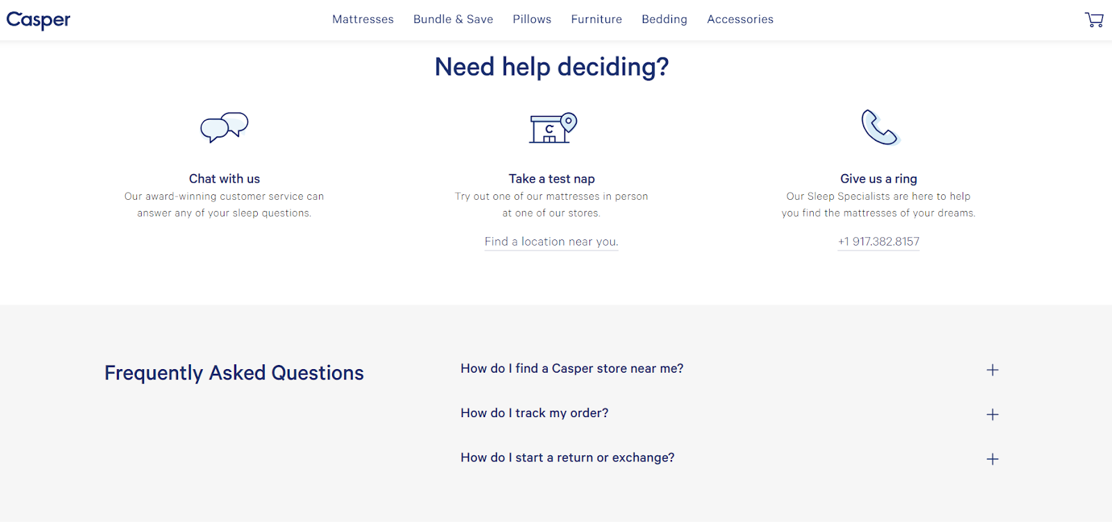
Casper offers accessible customer service options for their customers, ensuring that help is just a few clicks or a phone call away.
Conclusion
To ensure your eCommerce product pages are competitive in 2024, recap on essential practices: large clear images, detailed descriptions, SEO optimization, high-quality visuals, and transparent information about shipping and returns. In an era where mobile commerce predominates, these elements are non-negotiable to capture and maintain customer interest.
Remember to implement shoppable videos and customer reviews to add a level of trust and interactivity to your pages. Features like live chat support and clear pricing details also contribute to a positive user experience, bolstering conversion rates.
Don’t forget to test and update regularly—what works today may not be as effective tomorrow. Adaptation is key; monitor your page performance, collect feedback, and adjust to meet your users’ evolving needs. Leverage analytics to make data-driven improvements, and stay abreast of emerging trends to keep your product pages at the forefront of eCommerce.