eCommerce Web Design: 8 Must-Have Elements for Your Store’s Homepage
Web design is an often underrated element of conversion optimization. While it is certainly your means to make your website visually appealing, it can also help you direct your audience’s attention and actions.
In eCommerce, web design can help you create a beautiful, informative, optimized, and sales-oriented experience with the addition of some simple but effective elements. Here are eight elements that you simply have to consider.
Exceptional Social Proof
Social proof is a simple and effective way to check several marketing boxes. It:
- builds trust and credibility
- boosts conversion rates
- helps shoppers choose products that are actually right for them
It comes in numerous forms: ratings, reviews, testimonials, case studies, user-generated content, awards, and integrations, to name but a few.
Which ones you choose to include will depend on the nature of your products and the pain points of your audience. Of course, there’s nothing stopping you from including more than one.
To help you get an idea of the possibilities, let’s examine Shop Solar Kits and all the various types of social proof they’ve added to their homepage:
- Their header notes that they have over 30.000 satisfied customers.
- They have a floating “reviews” button that opens up a detailed list that can be filtered in numerous ways, making it easy for leads to check out videos and images, as well as good or bad reviews.
- All of their product links come with star ratings below the product name.
- They have several affiliation logos in the footer and provide numerous checkout options.
- Perhaps most notably, they have an amazing user-generated content section that shows photos of actual projects. Each project lists exactly which products were used and comes with a brief blurb from the customer. More than any other element, this one demonstrates value.

Trust Badges
Another conversion-boosting element you should definitely feature on your homepage is trust badges. They are very effective in helping visitors overcome the usual obstacles that cause high cart abandonment rates: shipping costs, shipping times, complex checkout processes, lack of a return policy, and so forth.
Depending on your niche, you will need to consider different trust badges. Free shipping and easy returns work for every brand, but you should definitely take it a step further.
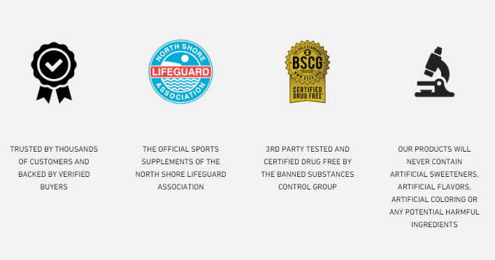
Here’s an example from ATH, a brand that sells supplements. Since they operate in the YMYL niche, their trust badges need to address more than just shipping rates.
Cleverly, they’ve chosen four that are the most likely to overcome the most common conversion obstacles:
- They note that they are trusted and reviewed by plenty of customers.
- They make it clear they are the official supplement of a lifeguard association, which translates to practically instant trust.
- They are certified as drug-free, which is something that gym buffs are very passionate about.
- They are committed to the quality of their products.
All you have to do is find similar pain points and conversion obstacles for your audience and alleviate them with the clever use of simple icons.
Clearly Visible Shopping Cart
Another homepage (technically, sitewide) element that most brands think nothing about is the shopping cart. Yes, most of them feature it in their main menu. However, it’s often small, barely visible, and does not always feature the number of items currently located in the cart.
This is a very simple UX element that can quickly be tweaked, and it can boost user engagement significantly.
If the shopping cart is clearly visible, prominent enough, and easy to navigate, users will just have a better experience on your website. Whichever page they might find themselves on, they’ll know what they have in the cart.
Whether you choose to display the items in the cart on a hover action is up to you. Some websites do this horribly and cover the entire page with the popup, while others do it subtly and to great effect.
Here’s a decent example of a good main menu shopping cart. Ban.do have made their cart icon large and easy to spot, but it still takes nothing away from the seamless design of the main menu. Their hover popup is also small and not at all distracting but adds another layer of pleasant UX to the page.

Delayed Payment Options
The payment options you offer directly impact your conversion rates. The more payment options you can offer, and the more alternatives you provide with those options, the likelier customers are to check out.
This is another simple-to-add trust signal you can fairly easily implement to great success. And while e-wallets are practically a given, a delayed payment option — a buy-now-pay-later service like Klarna or Afterpay — can significantly increase both your average order value and your conversion rate. Klarna themselves claim that they increase the latter by 44%.
While signing up for this service will cost you, it’s nothing compared to the potential earnings you can expect to see. You naturally also need to make sure that you very prominently display the BNPL option you have chosen on your homepage.
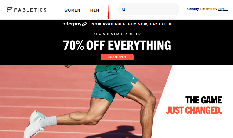
Fabletics have added it right below their main menu, just above their current offer. It’s easy to spot, blends in with the rest of the section, and is the perfect first piece of information to offer potential customers.
It works especially well paired with the 70% new member offer, as it gives you access to a fabulous item at a discounted price you don’t even have to pay for immediately.
Special Offers
If you think of your homepage as an advertising space and the likely first point of contact your potential shoppers will have with your brand, you naturally want to use it to display information that is the most likely to convert them.
In the world of eCommerce, that information is your special offer. Something that is time-sensitive, something that plays with FOMO, something that you don’t offer every day and that first-time (or even repeat) visitors will want to get their hands on.
Feature your special offer at the very top of your homepage. You don’t have to go and invent something super special. Displaying your new items, a discount you are currently running, an offer based on the season — all of these tactics work great.
Make sure you keep rotating the offer and that you always frame it so that it focuses on the benefit for the customer.
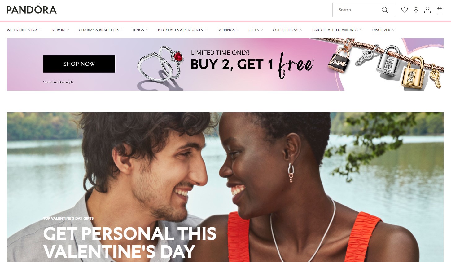
Pandora, for example, has a “buy 2 get 1 free” offer at the moment, which they have put at the top of their homepage. They are also running Valentine’s offer, but it’s not nearly as important as the first one, which is the likelier to convert and thus deserves pride of place.
Killer Value Proposition
Your value proposition is the first thing customers will read about your brand. They need to be on point, short, sweet, and hitting the nail on the head.
To write a killer value proposition:
- Pinpoint your customer’s key problem(s).
- Identify the benefits of your product.
- Identify why these benefits are of value to your customer.
- Tie the two together.
- Make yourself stand out from the crowd.
There are literally countless ways to do it, even without sounding too salesy. You can make it work even if you don’t use the power words most brands feel they need to reach for.
Let’s take a look at how Vivion positions its brand with a simple statement that elegantly addresses all of the above points.
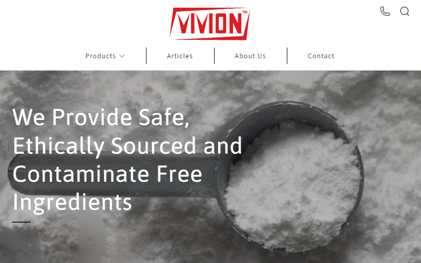
With the statement “We Provide Safe, Ethically Sourced and Contaminate Free Ingredients”, the brand makes it incredibly clear what they do, why they can be trusted, and what problems they’re solving for their customers.
Clear CTAs
If you want to improve your conversion rates, you need to start by reconsidering your CTAs. You may be able to get away with very generic CTAs if the rest of your page is on point, but why would you settle for a “buy now” and “get started” type of wording?
Consider the words you want to use first. Make them personal by speaking directly to the shopper whenever possible. Use action and power words that either evoke movement or clearly spell out the specific benefit of taking that action.
Don’t forget the design aspect of the CTA either. Make it pop with a bright choice of color, place it where it’s easy to click, especially on mobile screens, and make sure it matches the overall feel of the rest of the page.
The Dollar Shave Club has several great CTA examples. Their main one is “take a look,” so you get a bit more of a personable feel and don’t feel pushed to make a purchase either. The rest of them are perfectly straightforward, simply stating “buy” along with the specific product name.
The winning element is the choice of colors, which match to a T the color of their products.

Contact Information
Finally, you want to make sure that your contact information is very clearly displayed on the homepage. You want it in the footer, as that’s where it will always be easy to find, and you want it as detailed as possible.
If you omit this detail, you will inadvertently appear shady. Why wouldn’t you want people to contact you easily?
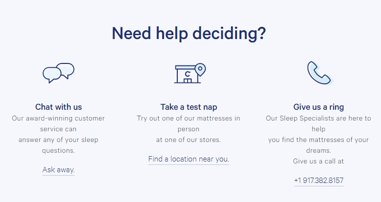
Cutting straight to our example, take a look at Casper. They have a contact element just above the footer, where they give their audience several options to get in touch. This instantly makes them more trustworthy and approachable, and it’s a great UX feature.
They have also clearly displayed all of their social media profiles and phone numbers in the footer, but they also have a chatbot, which is another amazing conversion tool, as it gives instant access to your customer service team.
Wrapping Up
Take a look at your store’s homepage and make sure that you have all of these elements in place. Make sure to also check out our examples and give them some thought. Is there anything you can do to improve the way you’ve implemented these vital elements?